A room that works begins with the wall behind it. Martha paints every building on her Bedford farm the same color, a warm gray she created herself and named after the town. The furniture arrived over decades. The copper was polished last Tuesday.
Martha Stewart home decorating is not a style you install in a weekend. It is a set of principles applied one room at a time, one material at a time, until the house looks like someone has been living well in it for years. The details are specific. The rules are few. And every one of them starts with the same question: is this real?
Here are 15 decorating principles drawn directly from Martha’s homes, her magazine, and her four decades of teaching people how to make a house feel like it belongs to someone who pays attention.
1. Start Every Room with a Neutral Backdrop
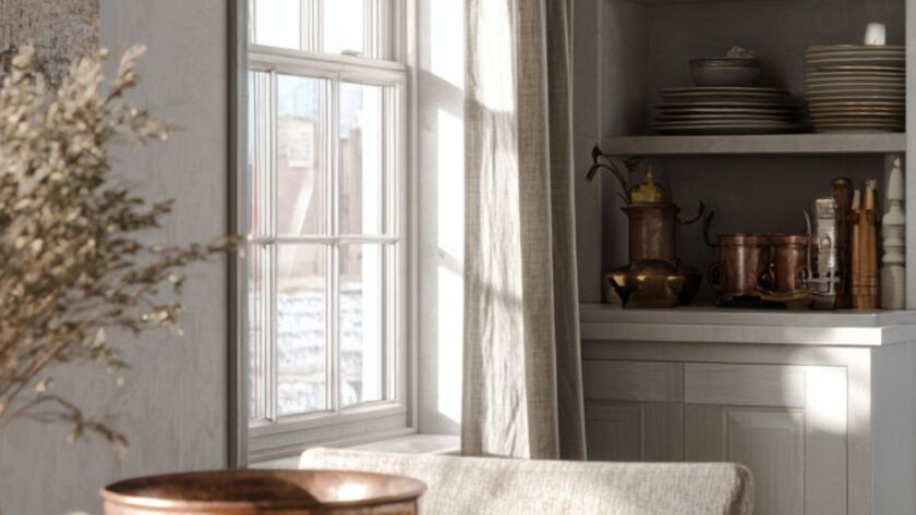
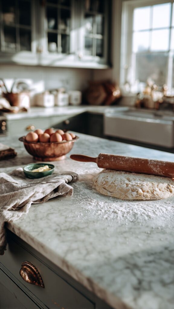
All of Martha’s interior projects begin the same way: walls in a clean neutral that suits the architecture. Pure white in a colonial. Warm ochre in a farmstead dining room. Bedford Gray across every structure on her 153-acre property in New York.
The neutral backdrop is not boring. It is the canvas that lets every object in the room speak. A copper pot against Bedford Gray walls glows. A jadeite bowl on a white marble counter becomes the only color the room needs.
2. Paint Your Trim a Shade Lighter Than Your Walls
Martha never paints trim stark white against colored walls. The trim is always a shade or two lighter than the surrounding wall, creating a subtle frame rather than a hard line. The effect is a room that breathes rather than one divided into planes.
This single technique makes a room feel considered. Stark white trim against dark walls creates a visual shock. A quieter contrast, where the trim is cream against pale sage or soft white against warm gray, reads as architecture rather than decoration.
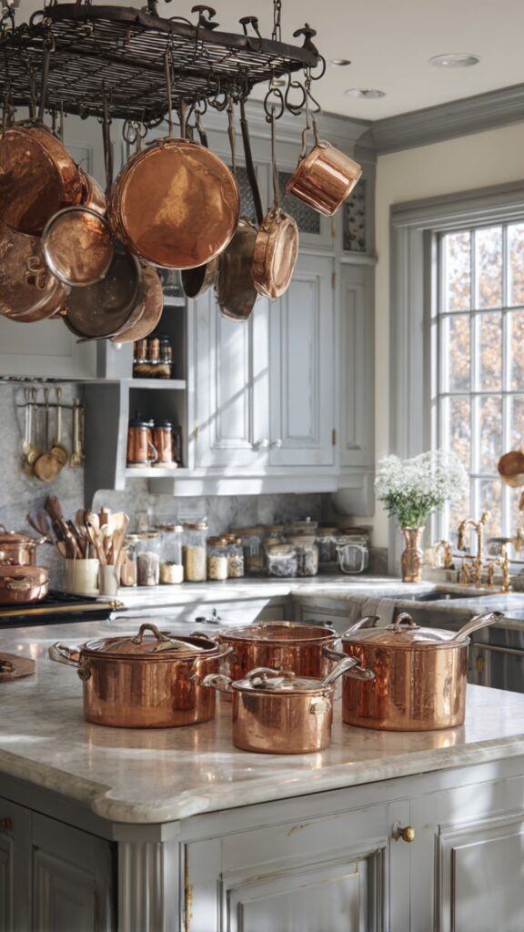
3. Hang Copper Where You Can See It
Martha’s copper pots hang from a rack above the kitchen island at Bedford. They are polished after every use and returned to the rack facing outward. “Copper isn’t just there for decoration, we definitely use it,” she told Frederic magazine. “But it’s also important to look good.”
A hanging rack of copper transforms a kitchen from a workspace into a room with visual warmth. The metal catches light differently at every hour. Morning sun turns it amber. Candlelight turns it rose. No other material performs this way.
4. Display What You Use, Store What You Do Not
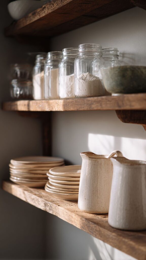
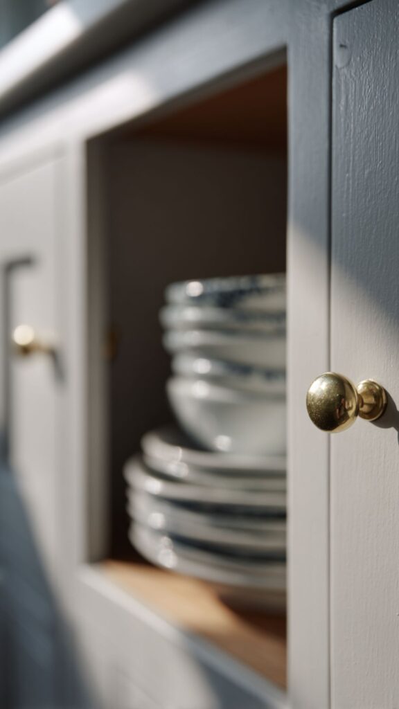
Open shelving in Martha’s kitchens holds the things she reaches for daily: ironstone platters, white stoneware, glass jars of flour and sugar. Drawers and closed cabinets hold everything else. The rule is simple: if you use it often and it is worth looking at, display it.
This principle separates a Martha kitchen from one that looks styled for a photograph. The displayed objects carry the wear of real use: a wooden cutting board with knife marks, an ironstone pitcher with fine crazing, a copper bowl with a patina that deepens each week.
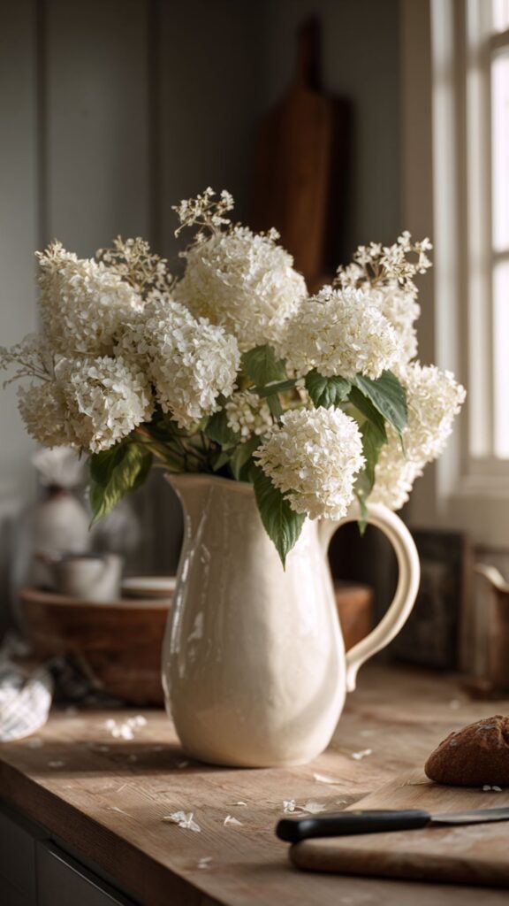
5. One Flower, One Vessel, Full Commitment
Martha’s signature floral approach is monochromatic: one variety, one color, arranged in generous abundance. Fifteen white Annabelle hydrangeas in an ironstone pitcher. A mass of garden roses packed into a copper urn. A single dahlia variety filling every vessel on the dining table.
Mixed bouquets look assembled. A single flower repeated in quantity looks intentional. The impact comes from volume, not variety. A handful of peonies in a small vase is pleasant. Twenty packed into a large ironstone pitcher is the Martha decorating moment.
The backdrop is set and the materials are chosen. What follows adds the texture and sensory detail that make a house feel like someone has lived well in it for years.
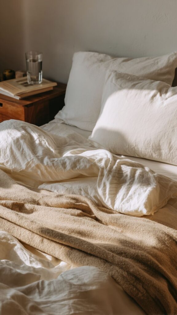
6. Linen Over Polyester, Always
Every textile in a Martha Stewart home is a natural fiber. Linen tablecloths, cotton slipcovers, wool throws, and silk curtains. No polyester, no microfiber, no synthetic blends. The texture of real linen, slightly wrinkled from washing, creates a warmth that no rental fabric can match.
Linen in cream or putty serves as the foundation for every surface where fabric matters: the dining table, the sofa, the guest bed. Martha folds napkins simply and stacks towels in thirds. The weight and softness of real fabric registers in the hand before the eye.
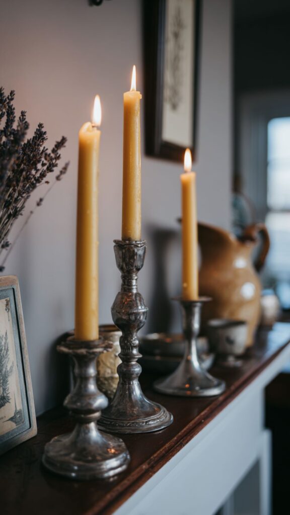
7. Beeswax Candles as a Decorating Material
Beeswax tapers appear in every room of every Martha Stewart home. Silver candlesticks on the dining table. Brass holders on the mantel. Pewter stands on the nightstand. The warm honey color and faint natural scent create atmosphere no electric light can replicate.
Martha never uses paraffin. The difference shows in photographs and in person: beeswax burns golden and drips slowly, while paraffin burns white and smokes. A pair of beeswax tapers in mismatched vintage candlesticks is the single fastest way to make any room feel like a Martha Stewart home.
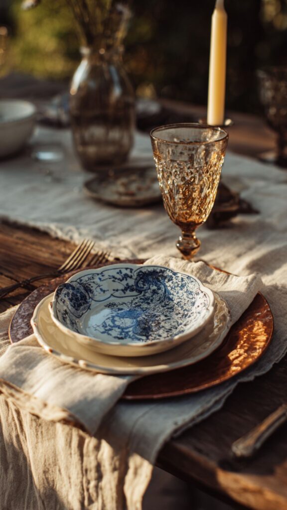
8. Collected, Not Coordinated
Martha’s dining chairs are not all the same. Her candlesticks are mismatched. Her plates layer ironstone dinner plates with transferware salad plates and plain bread plates. The settings look gathered from decades of living, not ordered from a catalog.
This is the hardest principle to teach and the most important. A coordinated set looks purchased. A collected room looks inherited. Start with one good piece, a single ironstone platter or a brass candlestick, and build slowly. The room will look more Martha at twelve pieces than at fifty, because each one was chosen.
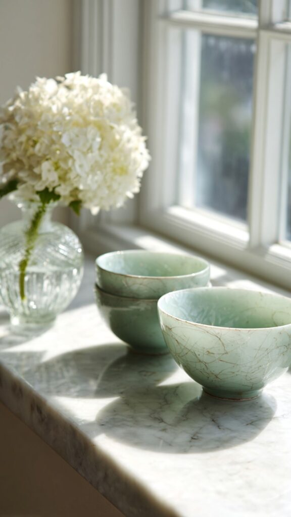
9. Use Glass to Move Light Through a Room
Pressed glass, mercury glass, and jadeite all serve the same function in Martha’s decorating: they catch light and scatter it. A pressed glass goblet refracts candlelight in small shifting patterns. Mercury glass votives create a mottled, warm glow. Jadeite on a windowsill turns sunlight green.
Placing glass objects where they intersect with natural or candlelight costs almost nothing. A row of pressed glass votives on a mantel. A jadeite bowl in a window. Mercury glass clustered on a dining table. The room changes character as the light source shifts from sun to flame.
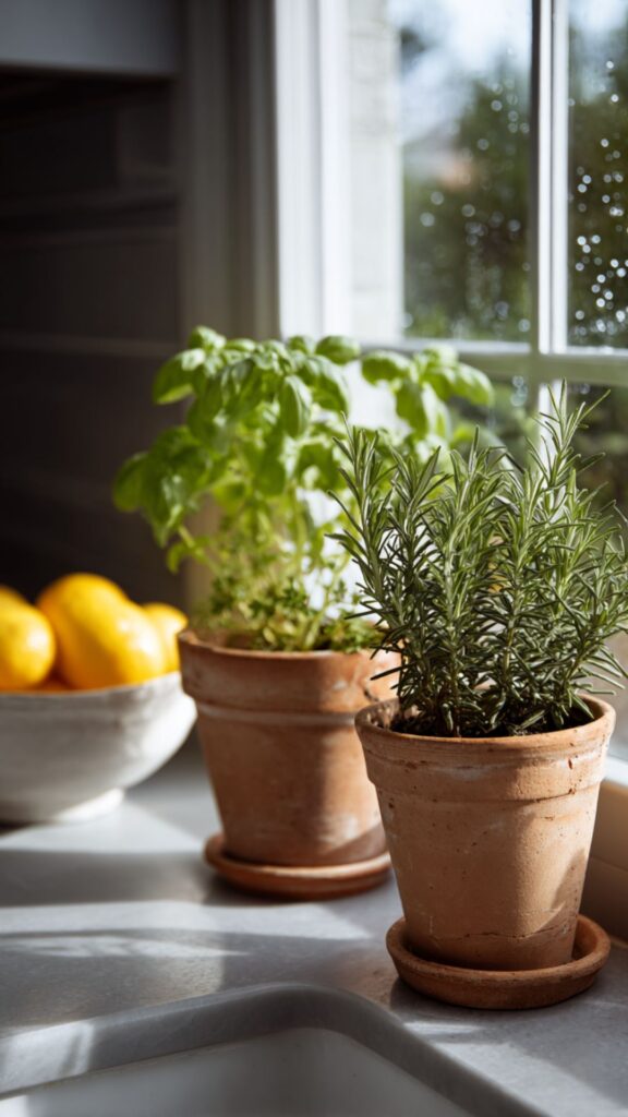
10. Every Room Deserves a Living Thing
Martha keeps houseplants in every room, including the kitchen, the bathroom, and the bedroom. Potted herbs on the counter. A fern on the bathroom ledge. A collection of tropical specimens she rotates between indoor rooms and her greenhouse with the seasons.
A room without a plant in it feels staged. Even a single potted herb on a kitchen windowsill breaks the stillness and reminds you that a living person tends this space. The principle works at any scale: one plant per room, chosen for the light it receives, watered when it needs water.
The rooms have their bones and their texture. What follows carries the philosophy into the choices that make a house feel alive in every season.
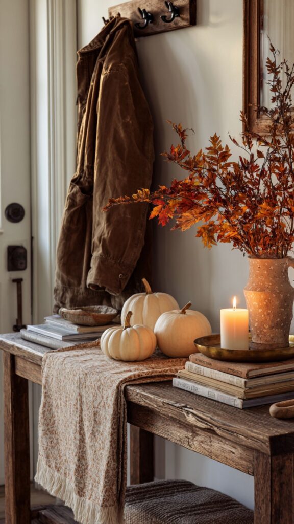
11. Decorate with the Season, Not with a Theme
Martha changes her decor with the calendar, not with trends. Forced bulbs in winter. Garden flowers in summer. Pumpkins and maple branches in autumn. Gold candles and evergreen wreaths at Christmas. The house reflects what is happening outside the window.
Seasonal decorating is the opposite of thematic decorating. A theme is imposed from outside: “coastal” or “rustic” or “farmhouse.” A season is observed. You bring in what is growing, what is ripe, what is falling from the trees. The house stays the same. The details rotate.
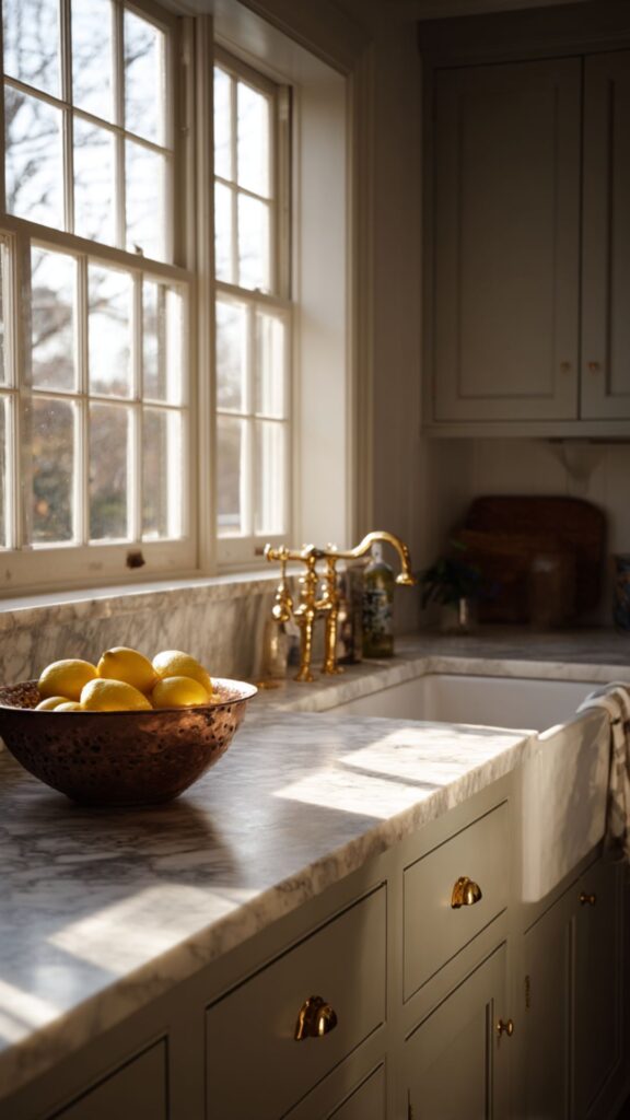
12. Stone and Wood Over Laminate and Veneer
Martha’s countertops are marble or soapstone. Her floors are hardwood or reclaimed stone. Her cutting boards are solid wood, not bamboo laminate. The material philosophy is consistent: choose what ages well, not what arrives perfect.
Real materials develop character. Marble stains slightly and gains a patina. Soapstone darkens with oil. Hardwood floors scratch and warm with traffic. These marks are not damage. They are evidence of use. A house made of real materials at thirty years looks better than it did at one.
13. Keep Hardware Simple and Small
Martha’s cabinets at Bedford use small brass knobs. No oversized pulls, no statement handles, no brushed nickel bars. “I like small knobs that are efficient and pull out so you don’t catch anything on the cabinets,” she told an interviewer. “My drawers have small knobs on them.”
Simple hardware disappears into the architecture. Statement hardware announces itself and dates the room to the year it was installed. A small knob in brass or polished nickel says nothing about the decade and everything about the intention: this room was designed to last.
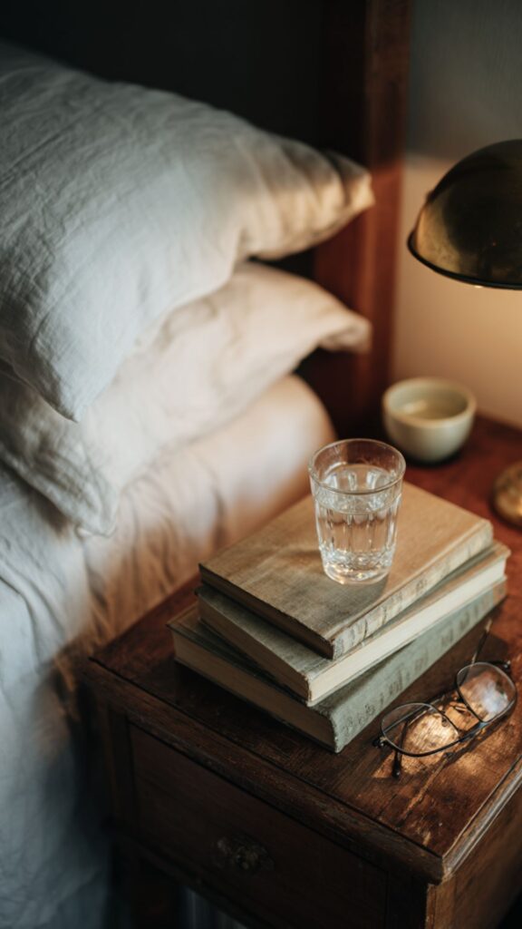
14. Books Belong in Every Room
Martha stacks books on nightstands, coffee tables, kitchen counters, and bathroom shelves. They are not decorative objects arranged by spine color. They are books she reads, references, and returns to. A stack of gardening books on the kitchen counter is both decoration and tool.
Books anchor a surface the way nothing else can. A nightstand with only a lamp looks empty. Add a stack of three books and a glass of water and the surface tells a story: someone lives here, reads here, sleeps here. The books do not need to match. They need to be real.
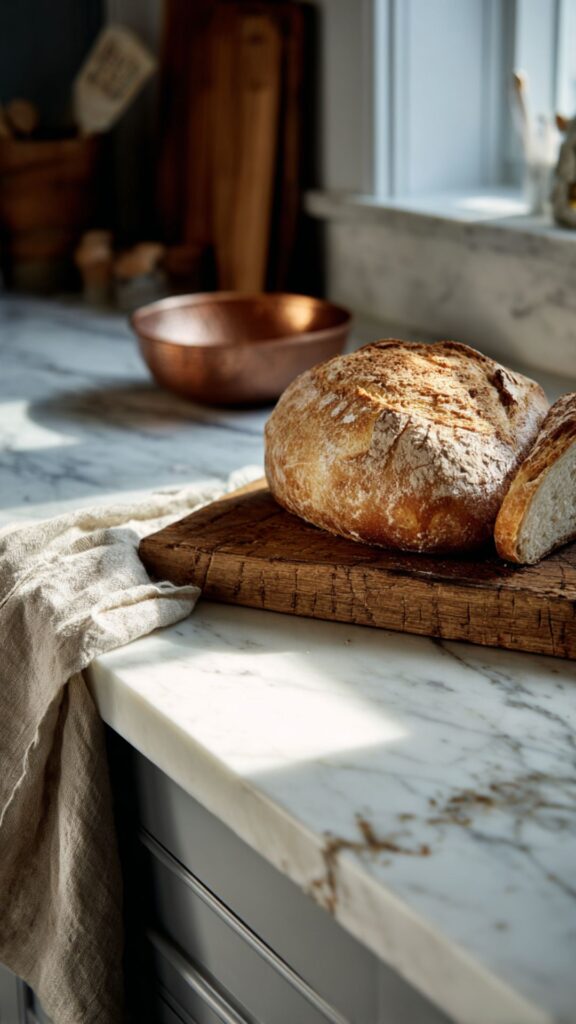
15. A Home Should Look Like Someone Just Stepped Away
The final principle of Martha Stewart home decorating is the most important: a room should never look untouched. A kitchen counter with a half-sliced loaf and a knife resting beside it. A reading chair with a book face-down on the arm. A table set for dinner with candles already lit.
The goal is not perfection. The goal is evidence of a life in progress. Flour dust on a marble counter. A linen napkin unfolded after use. A pair of garden gloves beside a vase of just-cut roses. The house is beautiful because someone is using it beautifully.
Martha Stewart home decorating is not a catalog you order from. It is a set of decisions made one at a time, over years, with real materials and real attention. Bedford Gray walls and copper pots and beeswax candles and ironstone plates. Each one chosen because it works, because it lasts, and because it gets better with every year of use.
Start with one room. Start with one wall. Paint it a color you can live with for a decade, and then place one object against it that earns its spot. The room will teach you what comes next.
A house decorated this way does not look like a year. It looks like a life.