A single wall of hand-printed botanical paper changes the temperature of a room before you even step inside. The ferns are slightly imperfect, the cream ground has a warmth no paint can match, and the whole thing smells faintly of old books and linen.
That is the power of Martha Stewart aesthetic wallpaper. It is not about covering every surface in pattern. It is about choosing one intentional paper, placing it with restraint, and letting it do the work of a dozen decorating decisions at once.
Generic wallpaper trends chase novelty: neon geometrics, oversized tropical leaves, peel-and-stick marble. Martha’s approach is the opposite. She favors patterns rooted in history, printed on real paper, in colors that have existed for centuries. Her design editor Kevin Sharkey has demonstrated this philosophy in room after room in the pages of Martha Stewart Living, and it remains the standard for walls that feel both timeless and alive.
These 17 ideas will help you choose, place, and style wallpaper the Martha way.
1. Botanical Prints on a Cream Ground
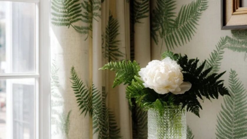
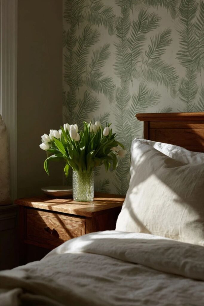
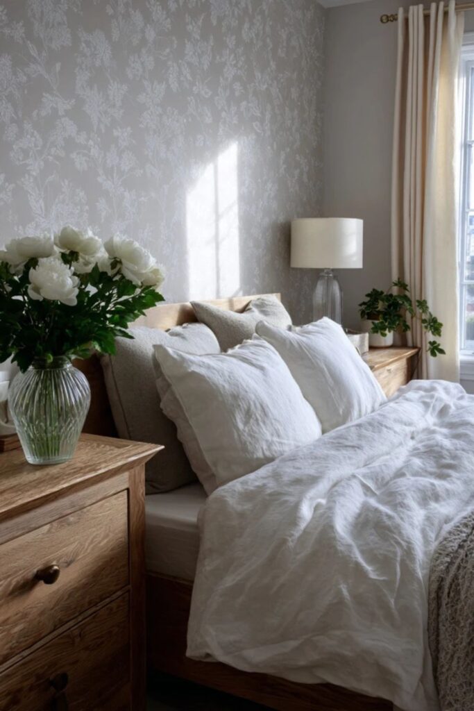
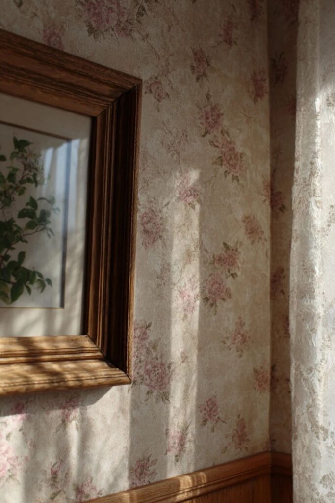
Botanical wallpaper is the most Martha pattern of all. Hand-drawn ferns, pressed flowers, trailing vines, and seed-pod illustrations on a warm cream or ivory background. The drawings should look like they came from a naturalist’s sketchbook, not a graphic design studio.
The best botanical papers use a limited palette: sage green and cream, soft blue and white, or sepia and ivory. The cream ground does the heavy lifting, keeping the room light while the botanical motif adds quiet interest. This is the paper Martha would choose for a guest bedroom or a study where the walls need to feel like a garden in January.
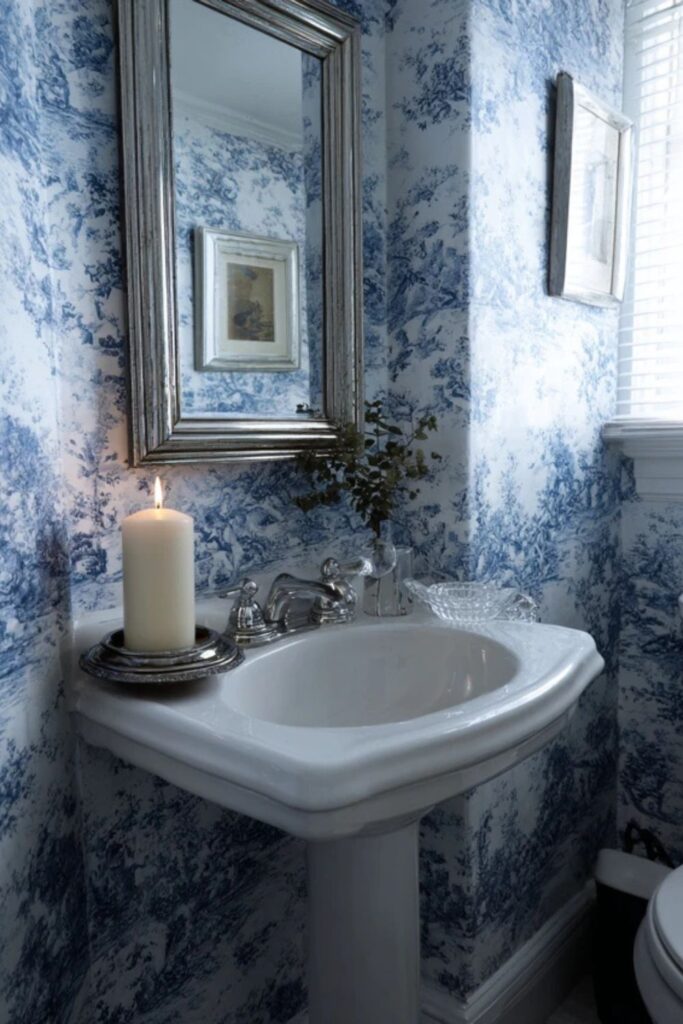
2. Toile de Jouy in a Single Room
Toile is the wallpaper Martha reaches for when she wants a room to feel like a chapter from a French novel. The traditional pastoral scenes, shepherds and bridges and flowering trees, are printed in a single color on white or cream. Blue toile is the classic, but Turkey Red toile on cream is pure Martha.
Use toile in one contained room: a powder room, a small bedroom, or an entryway. Covering every wall in the same pattern creates an enveloping, jewel-box effect. The trick is matching the fabric to the paper, using the same toile on curtains or a chair, so the room reads as one finished thought.
3. Grasscloth for Texture Without Pattern
Grasscloth is wallpaper for people who love Martha’s natural materials philosophy but do not want a printed pattern on their walls. Woven from real plant fibres like jute, seagrass, or bamboo, grasscloth adds warmth and depth with texture alone. Every panel is slightly different because the fibres are natural, which gives the wall a handmade quality.
Choose grasscloth in warm neutrals: putty, oatmeal, soft sage, or Bedford Gray. The texture catches side light and shifts throughout the day, making the wall feel alive. Martha’s preference for real materials over synthetic ones makes grasscloth a natural fit for any room in her world, from a living room to a hallway.
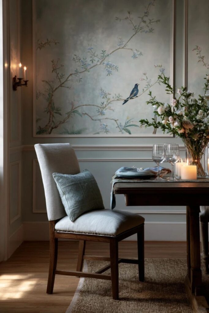
4. Chinoiserie Panels as Art
Martha used chinoiserie furniture in her famous red-drenched bedroom at Bedford, and the aesthetic extends naturally to wallpaper. Chinoiserie panels, hand-painted scenes of birds, flowering branches, and distant pagodas on silk or paper, function more like art than traditional wallpaper. They deserve to be framed by the wall, not repeated across it.
Hang chinoiserie panels on a single wall in a dining room or above a console in an entry. Frame them with painted trim in white or Bedford Gray. The panels should float on the wall like paintings, surrounded by enough empty space to let each scene breathe and be studied.
Those first four choices, botanicals, toile, grasscloth, and chinoiserie, are the foundation patterns. Each one has roots in craft and history, which is what separates Martha wallpaper from trend-driven alternatives. The next group focuses on how colour and tone shape the mood.
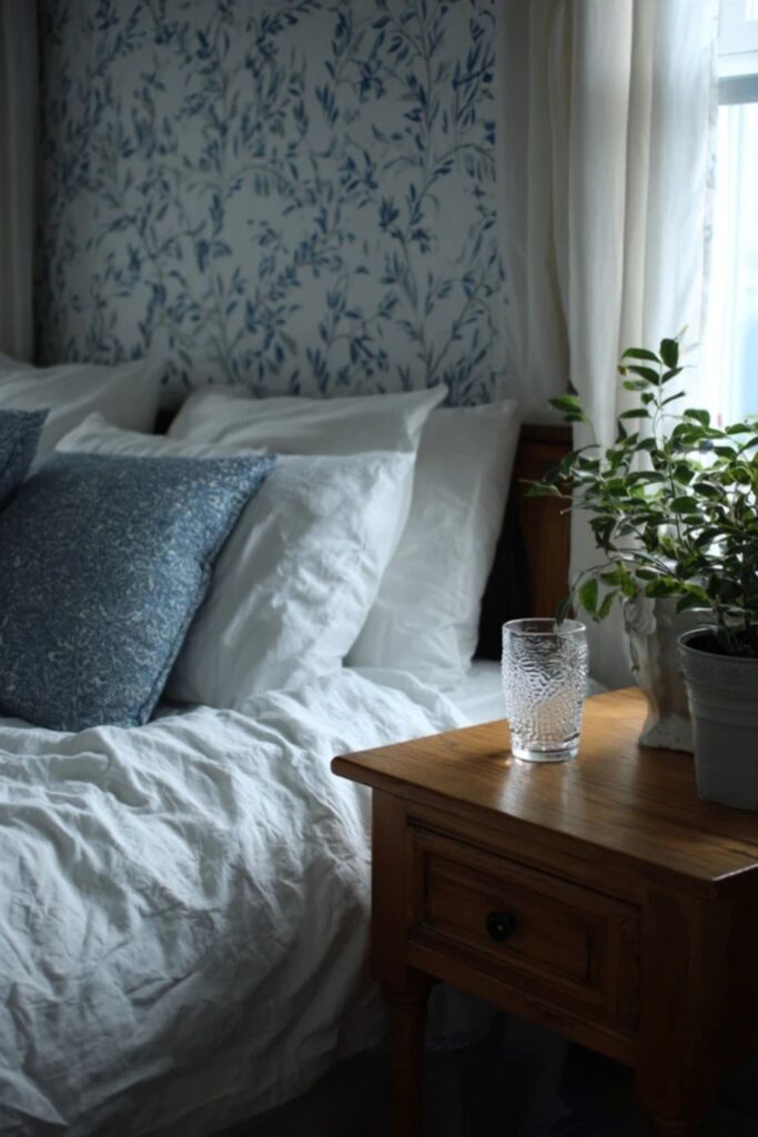
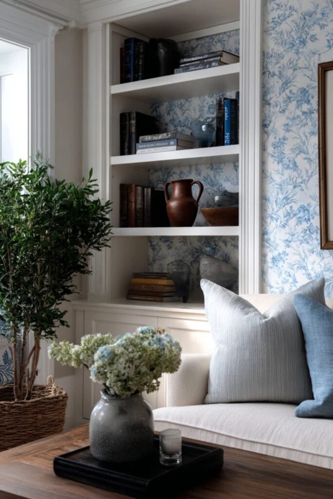
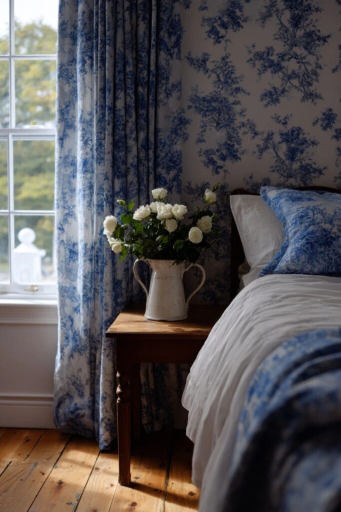
5. Blue and White as the Safest Palette
Blue and white is the wallpaper colour combination that never falls out of favour in Martha’s world. It works in every room, every season, and every pattern type. Blue toile on white. Blue botanical on cream. Soft Araucana blue grasscloth with white trim. The pairing reads as clean, fresh, and historical all at once.
The shade of blue matters. Martha’s blues are never electric or cobalt. They are dusty, muted, and slightly grey: the colour of old Delft pottery or a faded linen shirt. Pair blue and white wallpaper with cream linen curtains and ironstone on the shelves, and the room will feel like it has always been there.
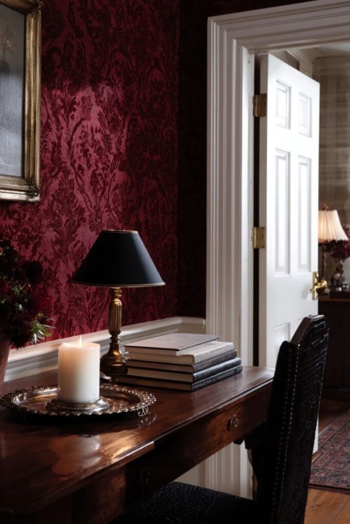
6. Turkey Red for a Bold, Historical Room
Martha’s Turkey Red is not bright or modern. It is the deep, muted red of antique textiles, old book bindings, and 18th-century document prints. A Turkey Red wallpaper in a toile or damask pattern makes a room feel like a private library in an English country house.
This is a commitment colour. Use it in a small, enclosed room where the richness can surround you: a study, a dining room, or a hallway. Balance Turkey Red walls with cream trim, natural wood furniture, and plenty of warm lamplight. The room will feel warm even in the coldest months.
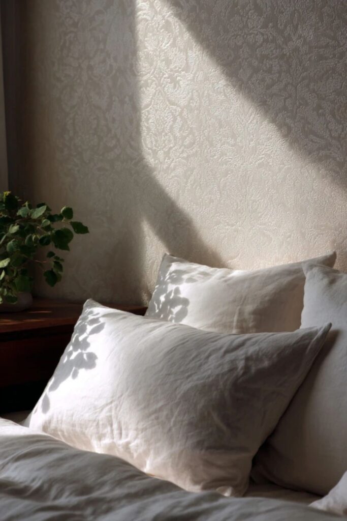
7. Cream on Cream Tone-on-Tone
For rooms where colour feels like too much, a tone-on-tone cream wallpaper adds pattern and depth without announcing itself. A cream damask on cream. A cream fern on ivory. A cream stripe on putty. The pattern is only visible when the light hits at an angle, which gives the wall a quiet, shifting life.
This is the wallpaper for a bedroom where you want softness above all else. It pairs with white linen bedding, natural wood, and the warm flicker of beeswax candles. The room reads as layered and considered, even though the pattern is nearly invisible from across the room.
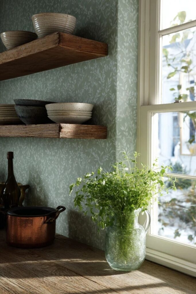
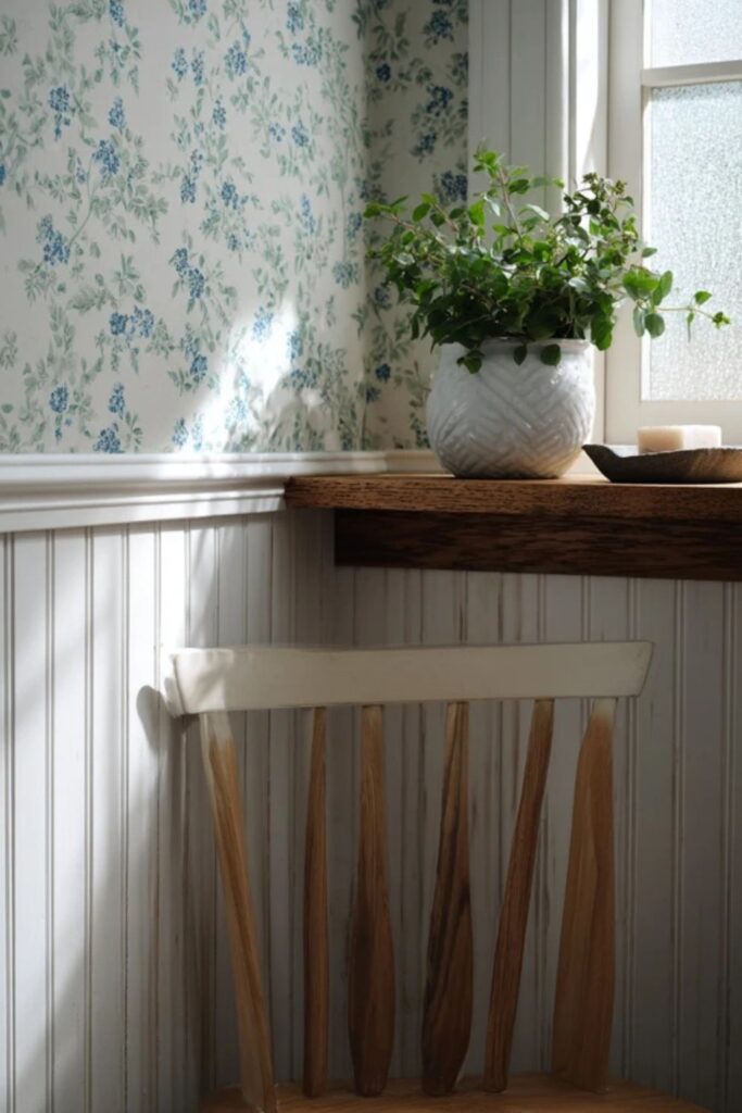
8. Sage Green in Kitchens and Garden Rooms
Sage green wallpaper connects a room to the garden outside without trying too hard. A soft green paper with a trailing vine or small leaf motif brings the outdoors in while keeping the room feeling calm and grounded. Martha’s kitchens and garden rooms often sit right at the edge of her Bedford property, and sage green wallpaper bridges that threshold.
Pair sage wallpaper with open wooden shelves, copper pots, and ironstone. The green reads as a neutral beside those natural materials. Avoid patterns that are too large or tropical. Small, repeating botanical motifs in the spirit of a kitchen garden suit the Martha Stewart aesthetic kitchen best.
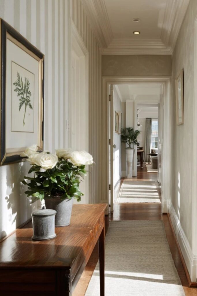
9. Stripes That Read as Architecture
A stripe is the most architectural wallpaper pattern. It draws the eye upward, makes ceilings feel taller, and adds formality without fuss. Martha’s stripes are never bold or contrasting. They are soft: cream and putty, Bedford Gray and white, or two tones of the same sage green.
Striped wallpaper works in hallways, entryways, and dining rooms where you want vertical structure. The stripe width matters too. Narrow stripes feel traditional and tailored. Wide stripes feel more modern and casual. For a Martha room, a medium-width stripe in two muted tones hits the right note.
The palette is set, from bold Turkey Red to barely-there cream. The next layer of ideas covers where and how to use wallpaper in ways that feel intentional rather than overwhelming, which is the difference between decorating and curating.
10. The Single Accent Wall
Martha’s approach to wallpaper is closer to disciplined editing than total coverage. One wallpapered wall in a room of painted walls creates a focal point without visual noise. The papered wall should be the one your eye lands on first: behind a bed, behind a dining table, or the wall facing the entrance.
Paint the remaining walls in a colour pulled from the wallpaper’s background. If the paper has a cream ground, paint the other walls cream. This trick makes the wallpaper look like it has always been part of the room instead of something added on top of a finished scheme.
11. Wallpaper Inside Built-In Shelves
Lining the back of built-in bookshelves or a china cabinet with wallpaper is a Martha move that adds pattern without committing an entire room. The paper becomes a backdrop for displayed collections: ironstone pitchers, pressed glass, leather-bound books, mercury glass ornaments.
Choose a paper with enough contrast to make the objects stand out but not so much pattern that the shelves look busy. A soft botanical, a muted stripe, or a natural grasscloth works well. The paper should serve the collection, not compete with it.
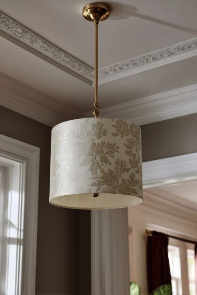
12. Wallpaper as Ceiling Treatment
Papering the ceiling is a move that Martha Stewart Living has featured in rooms where the walls are kept simple. A subtle pattern overhead, a cream-on-cream damask, a soft stripe, or a trailing vine, draws the eye upward and makes the room feel finished in a way that a white-painted ceiling never achieves.
This works best in smaller rooms with lower ceilings where you want to create intimacy. A powder room, a breakfast nook, or a reading corner benefit from the surprise of looking up and finding pattern. Keep the walls painted in a solid pulled from the paper, and let the ceiling carry the room.
13. Vintage Paper Left In Place
One of the most Martha things you can do with wallpaper is not choose it at all. Older homes sometimes have original wallpaper beneath layers of paint, and uncovering it, faded florals, aged toile, soft pastoral scenes, adds a patina no new paper can replicate.
If the original paper is in decent condition, leave it. Let it fade. Let the edges curl slightly where moisture has touched them. A vintage wallpaper that has lived in a house for decades carries more character than a brand-new roll. This is “collected over time” taken to its most honest form.
14. Beadboard Wallpaper for Cottage Texture
Martha Stewart Living produced a paintable beadboard wallpaper that mimics the look of real wooden beadboard panelling without the carpentry. Applied to the lower half of a wall beneath a chair rail, it adds cottage character and texture to kitchens, bathrooms, and mudrooms.
Paint it white, cream, or Araucana blue. The embossed lines create shadows that shift with the light, giving the wall dimension that flat paint cannot achieve. Top the beadboard section with a contrasting wallpaper above the chair rail for the classic Martha two-tone wall treatment.
Each of those placement strategies treats wallpaper as a purposeful choice rather than a background afterthought. The final three ideas focus on the small, unexpected ways wallpaper can finish a room the way a signature finishes a letter.
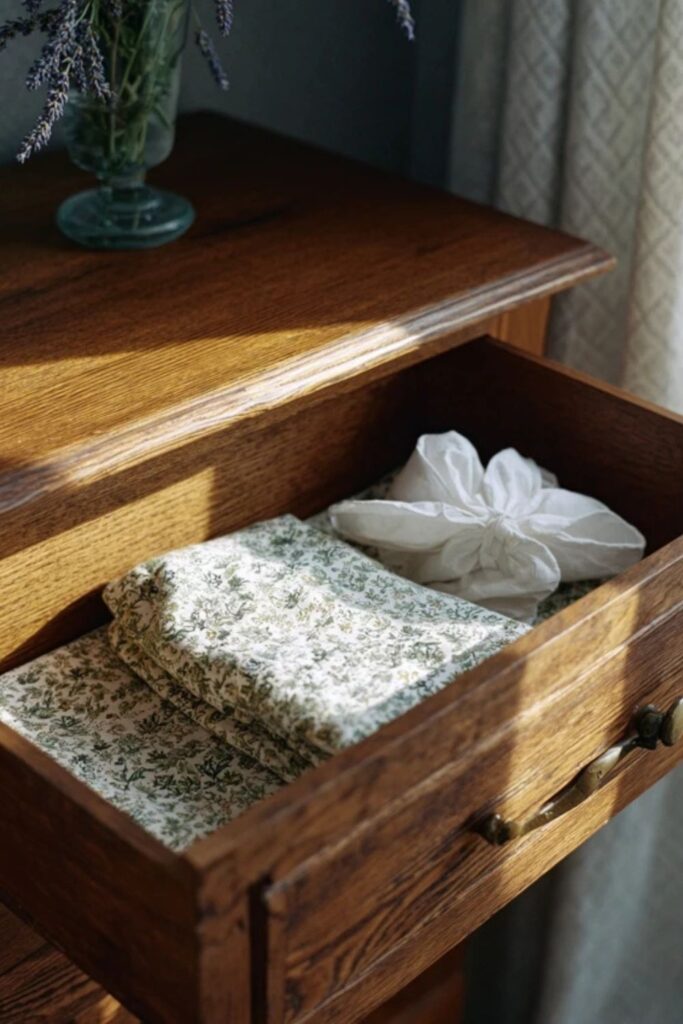
15. Wallpaper-Lined Drawers and Closets
Martha lines the insides of dresser drawers and linen closets with patterned paper. The pattern is hidden until you open the drawer, and then it greets you with colour and scent if the paper has been spritzed with lavender water. This small, private touch is the difference between a house that looks finished and one that feels finished.
Choose a paper that complements the room’s wallpaper or paint colour. A soft floral, a tiny stripe, or a botanical in a single colour works best. Cut the paper precisely and smooth it flat against the drawer bottom with wheat paste. The edges should be clean and intentional, never curling.
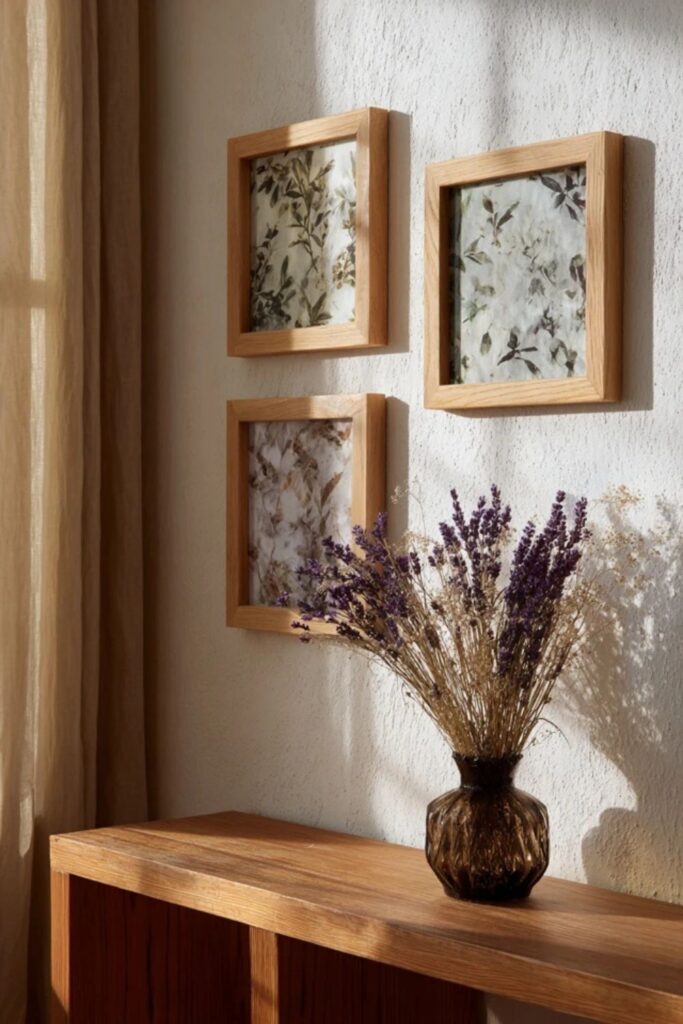
16. Framed Wallpaper Samples as Art
A leftover roll or a vintage sample of wallpaper can become art when placed in a simple frame. Martha’s approach to wall decor often favours the handmade and the found over the purchased, and a piece of toile or botanical paper in a thin wooden frame reads as collected rather than bought.
Group three framed samples of the same pattern in different colourways for a gallery effect. Or frame a single large panel of chinoiserie paper and hang it alone on a painted wall. The frame transforms the paper from a building material into something worth studying up close.
17. The Wallpaper and Fabric Match
The most polished wallpaper rooms in Martha’s world match the wall covering to at least one textile in the space. The same toile on the walls and the curtains. The same botanical on the wallpaper and the throw pillows. This full-commitment approach erases the boundary between furniture and architecture, making the room feel like one coherent thought.
This trick works best with patterns that have a clear background colour you can pull into the rest of the room. A blue toile room with white linen bedding, blue and white curtains in the matching toile, and ironstone on the nightstand is a complete Martha composition. The pattern wraps around you without ever feeling busy because the colour palette stays narrow and disciplined.
Martha Stewart aesthetic wallpaper is never an impulse decision. It is a commitment to a pattern, a colour, and a history that will live on your walls for years. The best wallpapered rooms feel like they were always meant to look that way.
You do not need to paper an entire house. Start with one small room, one pattern you would be happy to see every single morning, and one colour you already love. Line a drawer. Frame a sample. Hang a single panel in a powder room. The pattern will teach you what the room needs next.
The right wallpaper does not decorate a room. It gives the room a voice.
You might also like: