A copper pot catches the last streak of afternoon sun on a kitchen counter. Behind it, a stack of cream ironstone plates leans against the wall, and a linen towel drapes off the edge like it was set down mid-task.
You have seen this image a hundred times on Pinterest. That is a Martha Stewart aesthetic picture, and it follows a set of visual rules most people feel but cannot name.
The look is not about filters or staging tricks. It is about natural light, real materials, restraint in color, and the kind of abundance that comes from twenty of the same thing instead of one of twenty different things. Pinterest reported that searches for the Martha Stewart aesthetic climbed nearly 2,900% in 2025, proof that this visual language has become a shorthand for intentional living.
These 15 secrets will teach you to see the pattern, name it, and start creating it yourself. Each one builds on the last to form a complete visual vocabulary.
1. Natural Light Does All the Work
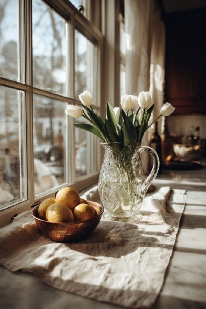
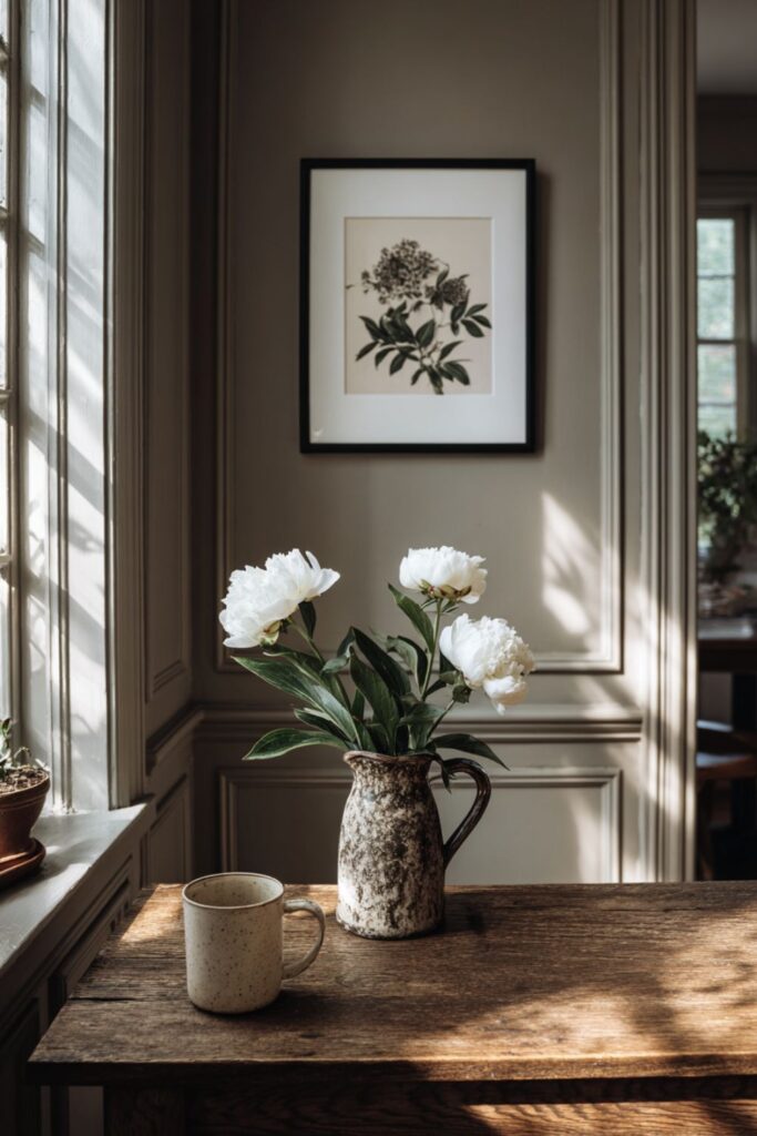
Every iconic Martha Stewart aesthetic picture relies on natural light. No ring lights, no flash, no overhead fluorescents. The light comes from a window, usually from the side, and it falls across the subject with soft, directional warmth that makes textures visible and colors honest.
Morning light gives images a cool, fresh clarity that suits kitchen scenes and garden harvests. Late afternoon light warms everything with gold, which is why so many of her dining room images glow like candlelit paintings. Both work for different moods, but the light is always real, and that single decision separates a Martha image from a catalog shot before anything else enters the frame.
2. A Muted Color Palette Held With Discipline
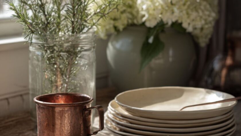
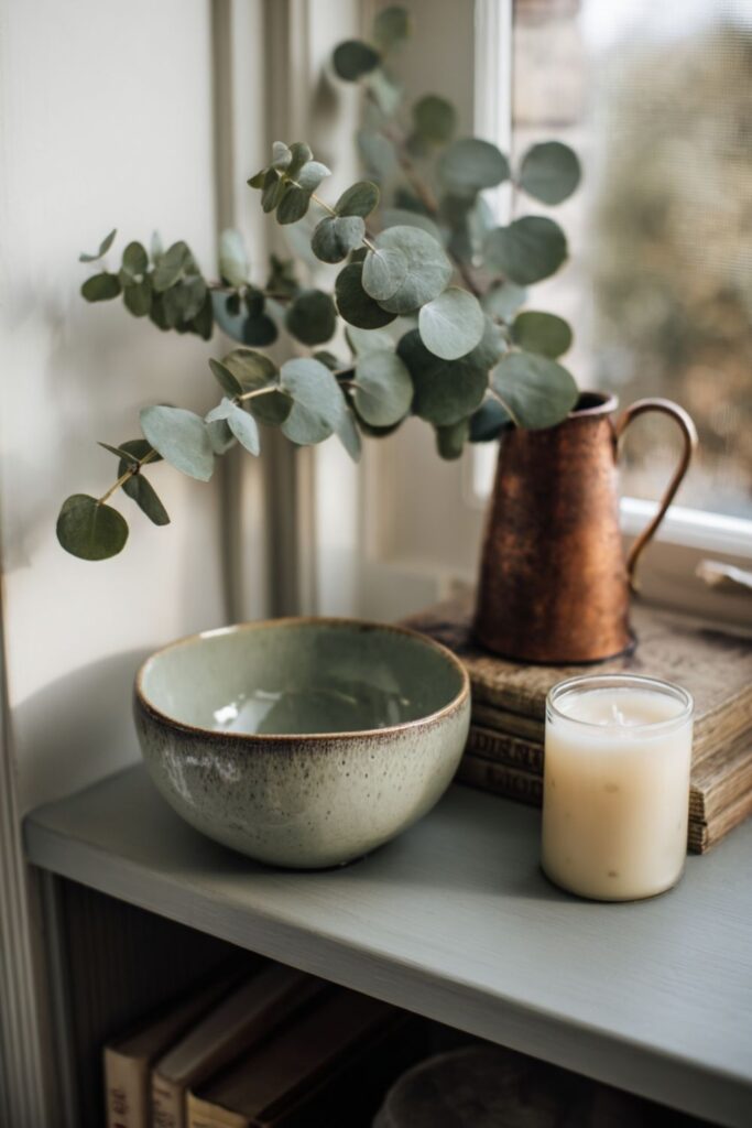
Martha’s visual world lives in a narrow band of color. Bedford Gray, cream, putty, Araucana blue, Turkey Red, jadeite green, and the warm glow of copper and aged gold. Every image commits to two or three of these tones and quietly leaves the rest out of the frame.
This discipline is what makes her pictures feel cohesive across different rooms and seasons. A kitchen shot in cream and copper shares the same restrained temperature as a garden shot in sage and white. The absence of bright, competing colors is what your eye reads as “calm” before your brain catches up, and it is the first thing to study when you are trying to recreate her look.
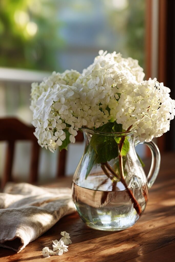
3. Abundance of One Thing, Not One of Everything
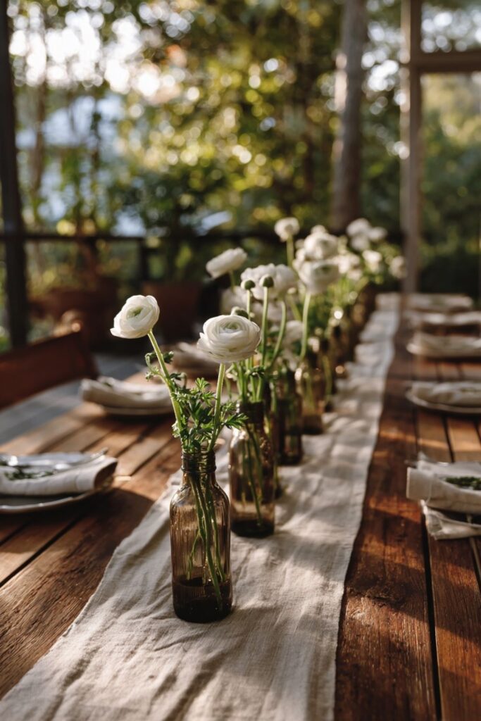
Mass planting is Martha’s signature, and it translates directly into her photographs. Twenty white paperwhites in a single wooden crate. A dozen copper pots hung in a row. Forty beeswax candles grouped on a single mantel. The repetition of a single element creates a visual rhythm that the eye follows with pleasure.
One vase with one flower reads as an afterthought. Twenty stems of the same bloom reads as intention, as a choice made with conviction. This single principle is the fastest way to make any photograph look like it belongs in Martha Stewart Living, and you will see it repeated in her party images, her tablescapes, and her garden beds alike.
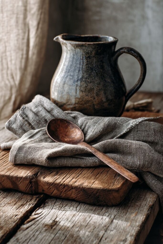
4. Real Materials You Can Almost Touch
Every surface in a Martha picture has texture you can feel through the screen. Linen with visible weave. Ironstone with its thick, uneven glaze. Copper with green patina creeping along the edges. Wooden boards with grain and knots that no machine could replicate.
These materials photograph differently than synthetics because they absorb and reflect light in unpredictable ways. A plastic bowl reflects a hard, uniform line of light. An ironstone bowl absorbs that same light and glows from within. Your camera knows the difference, and so does your audience, which is why every Martha Stewart aesthetic picture starts with what is real.
Those four principles, natural light, muted palette, mass repetition, and real materials, form the bones of every Martha image. What follows are the compositional habits that give those bones their shape and emotional weight.
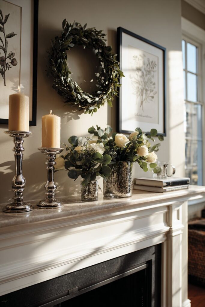
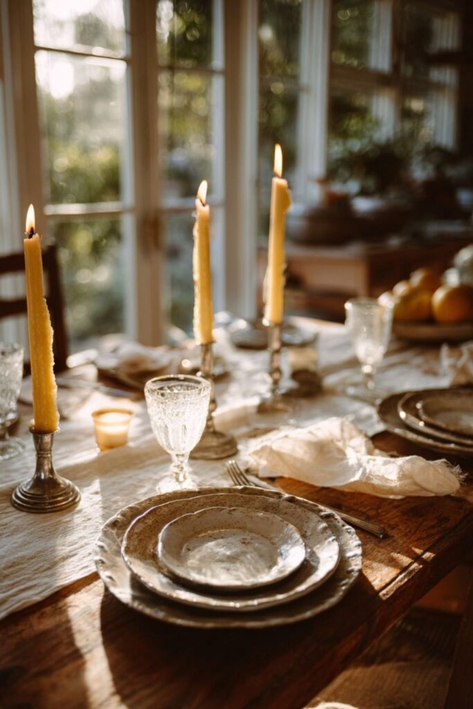
5. Symmetry as a Calming Force
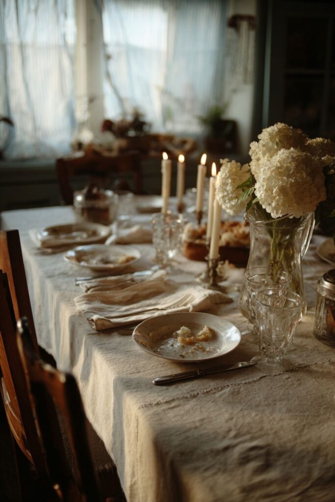
Martha’s photographs use symmetry the way a sonata uses structure. Two matching candlesticks on a mantel. Two identical topiaries flanking a doorway. A centered bowl on a centered table. The eye reads symmetry as order, and order registers as calm before a single word is read.
Look at any of her dining room images and you will see it. Chairs evenly spaced, napkins folded identically, glasses aligned at the same height. Symmetry does not mean rigid or boring. It means everything has been placed with enough care that the viewer can relax and stop searching the frame for something out of place.
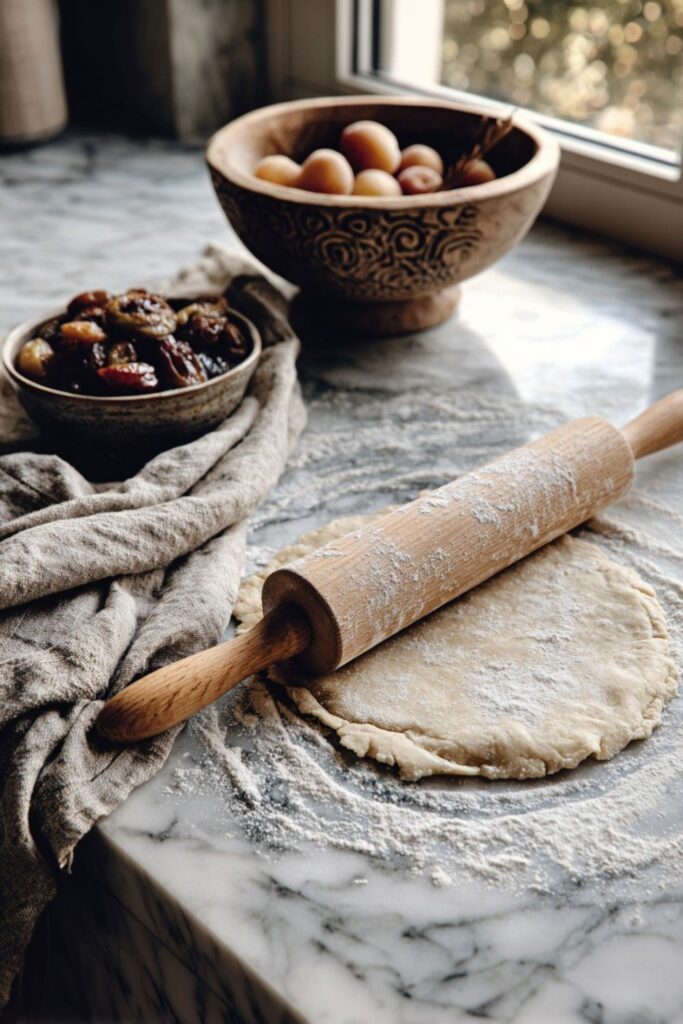
6. The “Unfinished” Moment
The most memorable Martha pictures look like someone just stepped away. Flour dusted across a wooden board next to a half-rolled pie crust. A basket of eggs with one already cracked into a jadeite bowl. A garden trug set down in the grass with clippers and a handful of cut roses still inside.
This staged imperfection is entirely intentional, and it is what separates her images from a showroom display. A perfectly arranged, untouched scene feels like a furniture store. A scene that looks mid-task feels like a life, and the kitchen aesthetic depends on this trick more than any other single element.
7. Negative Space That Lets the Eye Rest
Martha’s photographs never fill every inch of the frame. There is always breathing room: an empty stretch of linen tablecloth, an unadorned section of wall, a clear surface beside a small arrangement. The empty space is as carefully composed as the objects themselves.
This restraint is what her team calls “disciplined editing.” What you leave out of the picture matters as much as what you put in. A crowded frame reads as clutter, no matter how beautiful the individual objects are. A frame with open space reads as confidence, and confidence is what makes a viewer stop scrolling.
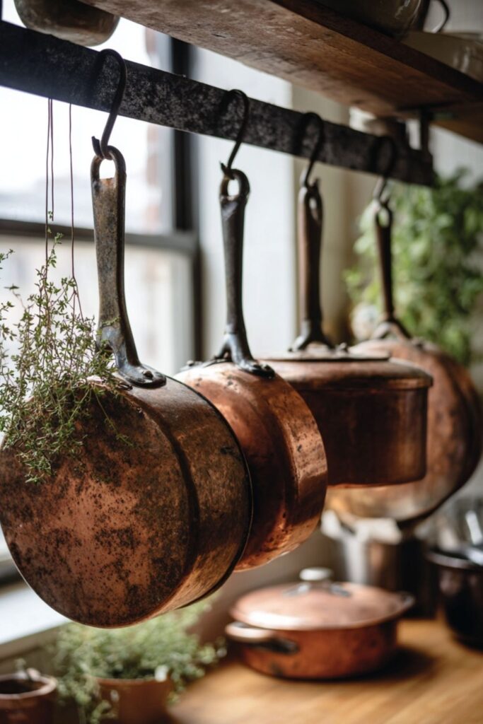
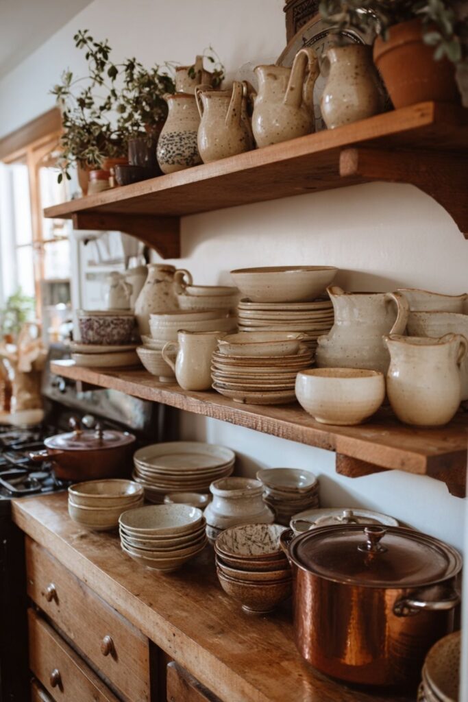
8. Collections Displayed With Purpose
Martha never hides her collections behind cabinet doors. Copper pots hang from iron racks. Ironstone platters line open shelves. Mercury glass ornaments fill a single wooden bowl to overflowing. The collection itself becomes the subject of the photograph, not a background detail.
The key is grouping by material: all copper together, all ironstone together, all pressed glass together. Mixed collections look chaotic in photographs. A single material displayed in mass looks like a gallery, and this is how her living room images achieve that quality of feeling collected over decades rather than bought in a weekend.
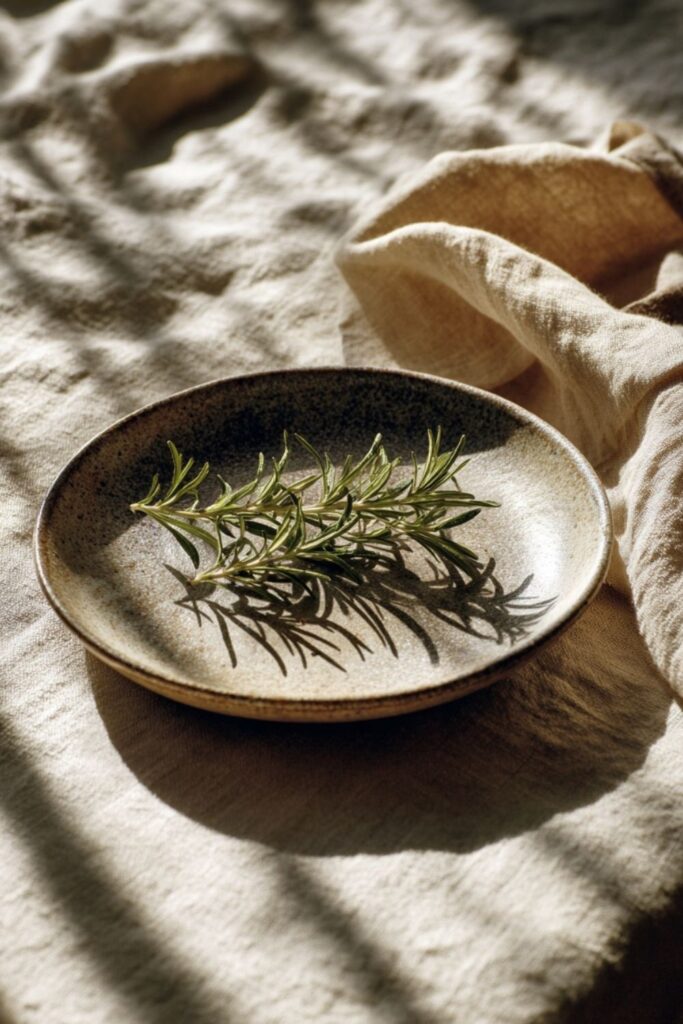
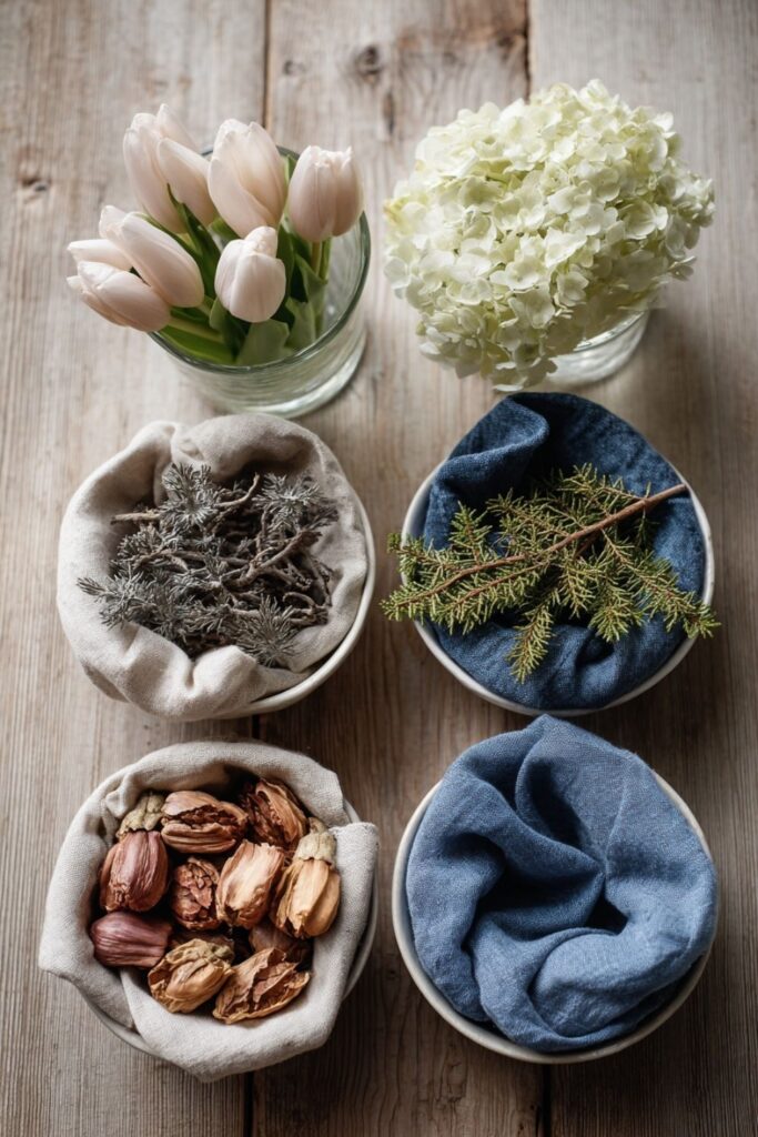
9. Botanicals as the Living Element
Flowers and greenery appear in nearly every Martha Stewart aesthetic picture, and they are never artificial. Fresh hydrangeas, garden roses, branches of eucalyptus, bundles of dried lavender, and forced paperwhite bulbs are the recurring cast. The plant life makes every image feel alive and rooted in a specific season.
A summer image features dahlias and bundles of garden herbs. A fall image shows branches heavy with berries and copper-toned mums. The botanicals tell the viewer what time of year it is without a caption, anchoring the image in a real and fleeting moment that a plastic arrangement could never create.
Composition and materials build the frame of every image, but the next layer of details is what gives a Martha picture its personality. These are the specific, recurring elements that make her visual language feel warm rather than clinical.
10. Copper Catching the Light
Copper is Martha’s secret weapon in photographs because it warms every image it touches. A copper pot on a stove, a copper ribbon tied around a bundle of herbs, a copper tray cradling beeswax candles. The metal reflects light with a soft, rosy warmth that no other material in her palette can replicate.
Copper also develops patina over time, which adds character and story to a photograph. A brand-new copper piece looks sharp and bright. A well-used one, with green edges and a mottled surface, looks like it has earned its place in the frame. Both work, but the aged version always tells the richer visual story.
11. Linen as the Quiet Background
Linen appears in almost every Martha aesthetic image as a supporting player that never steals the scene. A linen tablecloth beneath a place setting. A linen napkin folded beside a plate. A linen curtain filtering the light from a window. It never demands attention, but it grounds everything around it.
The texture of real linen, its visible weave and natural creases, photographs in a way that cotton or synthetic blends cannot match. It absorbs light softly and creates a surface that reads as handmade and honest. Pressed, stiff linen looks too formal for her style. Washed, relaxed linen with gentle wrinkles is the constant.
12. Candlelight as a Second Light Source
Many of the most iconic Martha images use two light sources at once: natural window light and candlelight. The combination creates a depth and warmth that a single light source cannot achieve on its own. Beeswax tapers in particular add a honey-toned glow that blends with late afternoon sun.
This layered lighting is especially visible in her dinner party and table images, where the candles do real work. They are never decorative props sitting cold in their holders. They are lit, burning, casting actual light and shadow. The slight flicker adds a sense of movement to a still image, even when frozen in a photograph.
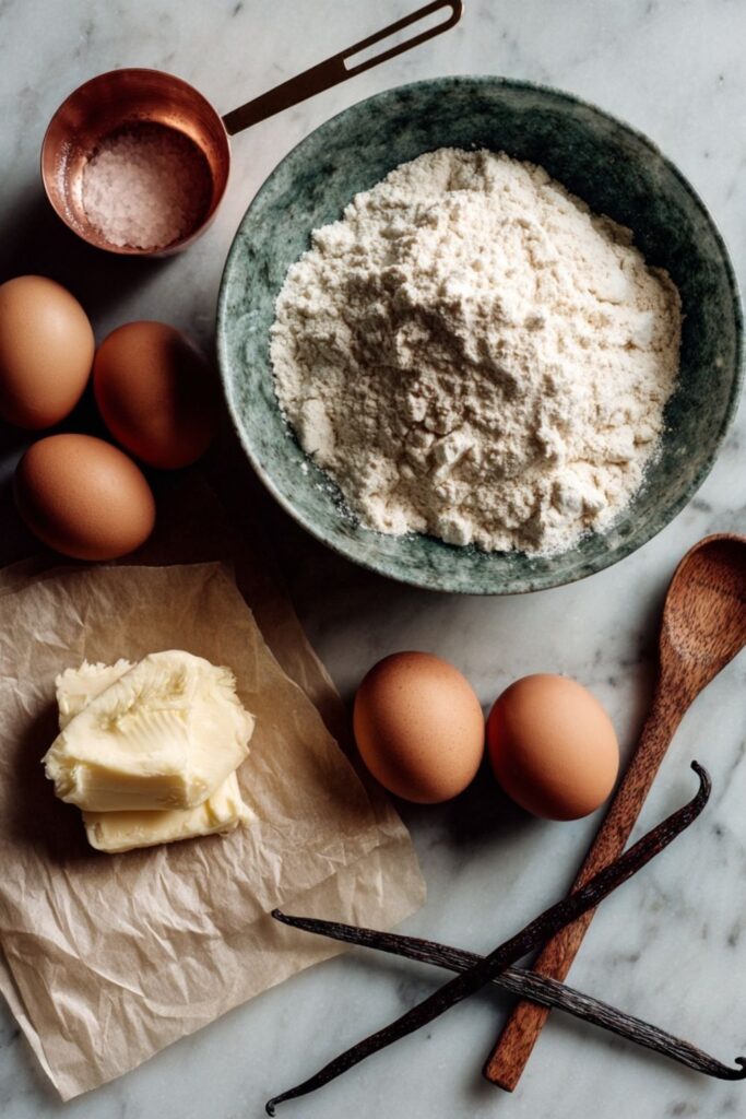
13. The Overhead Flat Lay
Martha Stewart Living popularized the overhead photograph decades before Instagram made it a daily habit. A flat lay of baking ingredients on a marble surface. A garden harvest spread across a wooden table. A collection of seed packets arranged by color on a linen cloth. The format turns ordinary objects into graphic compositions.
The overhead angle works because it removes depth and transforms objects into a pattern your eye can read all at once. The key is spacing: each object needs air around it so the viewer can identify every piece. Crowded flat lays lose the editorial quality that defines this aesthetic, so leaving open surface visible between items is more important than fitting everything in.
14. Seasonal Shifts in one
Martha’s pictures change palette with the seasons, and this consistency across months is a central part of the visual language. Spring images lean toward pale pink, cream, and fresh green. Summer images favor blue, white, and the grain of weathered wood. Fall shifts to copper, burgundy, sage, and warm neutrals.
Winter brings in Turkey Red, deep green, and the silver glow of mercury glass. A viewer can identify the season of a Martha image from the color temperature alone, without reading a single word. This seasonal commitment is what makes her visual archive feel like a living calendar, where each picture belongs to a precise and unrepeatable moment.
Every detail covered so far builds the visual vocabulary of Martha’s world. The final secret is the one that ties each picture together and gives the whole body of work its emotional center.
15. The Feeling of a Life Being Lived
The most shared Martha Stewart aesthetic pictures are not the most polished ones. They are the ones that feel lived in: a kitchen with a pot on the stove and steam rising, a garden path with muddy boots beside the gate, a table after a meal with crumbs and half-empty glasses and candles burned down to stubs.
These images work because they capture something honest. They show a home where cooking happens, where guests linger, where flowers get cut and arranged and allowed to wilt. The Martha aesthetic is not about capturing perfection in a frame. It is about documenting a life so intentional that even the ordinary, in-between moments look worth keeping.
The Martha Stewart aesthetic picture is not a passing trend. It is a visual philosophy rooted in honesty, natural materials, and the quiet confidence of knowing what belongs in the frame and what does not.
You do not need a professional camera or a Bedford farmhouse to start. Find one window with good light, lay down one linen cloth, place one real object with care, and leave everything else out. The restraint is the whole point.
A photograph taken this way does not just capture a room or a meal. It captures the feeling of being home.
You might also like: